
 In October 2013, the US Congressional debate over funding for the Affordable Care Act (commonly known as ‘Obamacare’) culminated in a 16-day government shutdown until major political parties could resolve the impasse. Messages on Twitter during this time period included sharply divided opinions about this event, with many people angry about the shutdown and others supporting the delay of the ACA implementation.
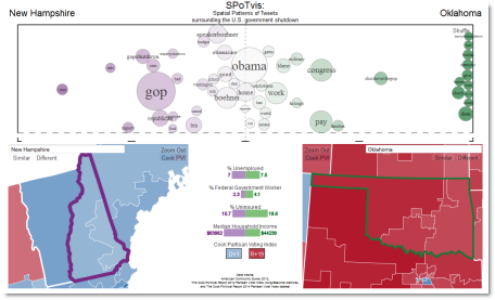
To help the public understand patterns in the discourse, we created SPoTvis, a web-based geovisual analytics tool for exploring Twitter messages (or ‘tweets’) collected about the shutdown. An interactive map connected to a term polarity plot allows users to compare the dominant subthemes of tweets in any two states or congressional districts. Demographic attributes and political information on the display enrich understanding of the units being compared. An option to ‘See similar districts’ reveals whether regional patterns exist in the discourse.
Taken together, these functions help us make sense of the way varying opinions and values appearing in a social media conversation across political regions. We found that a blame game was at play: people in Democratic-leaning states tended to talk about the GOP and the Tea Party, with people in Republican-leaning states focusing the conversation on Barack Obama and Harry Reid. In states near the nation’s capital, the conversation saw more emphasis on issues of work and furloughs.
Read more
Nelson, J., Quinn, S., Swedberg, B., Chu, W., and MacEachren, A. (2015) Geovisual Analytics Approach to Exploring Public Political Discourse in Twitter. ISPRS International Journal of Geo-Information, 4(1), 337–366.